Composition in Art
Composition is arranging the elements in your painting or photograph in a meaningful way. There are some rules you should follow, yet artists say some rules are meant to be broken.
Somethings I have learned over the years is that you never want your horizon line in the dead center of your painting or photograph. It should be either slightly above or below the middle.
Also, It’s important to make water straight. That is, parallel to the top and bottom of the painting. Otherwise, it will look unnatural.
Beginning a Sketch of Your Reference
I use a grid on my reference of one inch squares. Then I create another grid on my canvas. If my reference is 8x10 inches, and my support is 16x20 inches, I will draw a grid on my support to have 1-1/2 to 2 inch squares. My support is a canvas or panel. Personally, I use a canvas.
You would think I would make 2 inch squares, but when your working out from the center of the painting, you can lose the edges of your reference.
Once the grid is made, I use it to help sketch the reference, and increase the size of it according to the grid. Sometimes, I will make smaller squares inside the larger squares when I need to add an important detail.
The Rule of Thirds
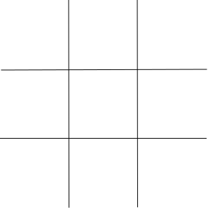
One way to layout your composition is to use the rule of thirds. This rule means you divide your painting or photograph by making two parallel lines to the top and bottom. Then, you make two perpendicular lines. These lines are equally spaced.
The idea is to place your main subject, your focus of the image, where the lines intersect. This rule makes your subject more interesting by not having it right in the center.
Also, when making a portrait, the eyes of your model should be near the top third line.
Rule of Odds
You should have an odd number of elements in your artwork. For example, you should have three birds in the sky rather than two. This creates a more interesting, natural image.
Simplification
Clutter in your artwork should be avoided. Having to many objects to focus on distracts the viewer from what you really want them to notice. You want to avoid a busy image.
In photography, a blurred background with the subject in focus will highlight what you really want the viewer to notice.
Use of Triangles
Along with the rule of thirds, you can create an interesting image by using a triangle. For example, you could compose the image with a person on the left third line, and have a smaller object where the point of the triangle meets on the right third line. Perhaps the person is looking at a distant object.
In a portrait, the eyes and mouth form a triangle as well.
Leading Lines
It’s important to have lines lead into the subject of your painting or photograph. The viewer’s eyes will follow these paths.
As an example, you might have a road disappearing into the background of your artwork. The viewer will pick up on this.
The Phi Grid
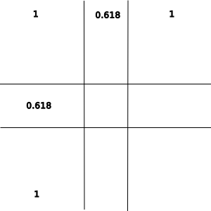
Like the rule of thirds, the phi grid divides the artwork into thirds, but the center squares are closer than the outer squares.
To better explain this, the outer squares are all of equal size, but the inner squares are 0.618 of the outer square’s size.
Where the lines cross it allows for a point of interest.
The Phi grid is based on the golden ratio, and is better for multiple subjects where as the rule of thirds is better for a single subject.
You might use it for a portrait of a child hugging their parent. The parent could be on the left vertical line while the child is on the right vertical line.
Conclusion
I hope this helps you when creating the structure of your artwork. There may be other rules, but these are the ones I know about.