Oil Colors
Originally, I started with Grumbacher Academy oil paints. They were super affordable, but I later learned that professional oil paints contain more pigment, and they have a stronger mixing strength. You need less paint to get the same mixture.
So, I went with Grumbacher Pre-tested oil paints because they were only slightly more expensive. I used them for almost nine years.
Recently, I started to transition to M. Graham oil paints. I chose them because they have a reputation for being highly pigmented. I like the feel of them too. Grumbacher paints are stiffer. Also, they use walnut oil as a binder.
Walnut oil dries slower than linseed oil. It also doesn’t yellow like linseed oil can. However, linseed oil makes a stronger paint film.
I use an alkyd resin like Winsor & Newton Liquin Original or Gamblin Galkyd as my medium. They both make paint dry faster, lower the viscosity, and make transparent glazes. They leave the paint with a glossy finish too. I mention this because they speed up the drying time of my paints, though, I have found the walnut oil still takes longer to dry, especially titanium white.
I recommend that you begin with a small palette of colors. I started with cadmium yellow light, alizarin crimson, french ultramarine blue, sap green, yellow ochre, and burnt umber. Later, I expanded my palette to include a wider range of colors. Below are my choices for my current colors.
Titanium White
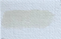 I use Titanium White Sunflower. I bought a small tube to try it out. I noticed it dried faster than the walnut oil version, but not quite as fast as linseed oil. Because it uses sunflower oil as a binder, there is less of a chance it will yellow.
Currently, I still use titanium white soft Grumbacher Pre-tested oil paints in a large, 150ml tube. I am moving away from it because it was very oily, and I’m not the only person I know with that problem.
Cadmium Yellow Light
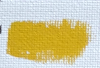 Cadmium Yellow Light by Grubmacher is a strong, opaque yellow paint. I find it to be a middle of the road yellow color. Cadmium paints tend to dry slowly.
Bismuth Yellow
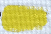 Bismuth Yellow by Grumbacher is more transparent than cadmium yellow light. It is a cooler yellow too.
Anthraquinone Red
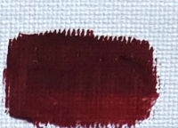 Anthraquinone Red by M. Graham is a cool red compared to a warmer cadmium red. It is also known as permanent alizarin crimson. Alizarin Crimson is a fugitive color that can lighten over time. Anthraquinone red is a more lightfast choice. It’s a transparent color like alizarin crimson too.
Naples Yellow Italian
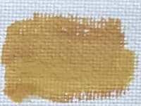 Naples Yellow Italian by Williamsburg is the only tube of oil paint by Williamsburg that I own. Williamsburg Oil Paints from Golden are highly regarded as well. The M. Graham version uses Hansa Yellow, Titanium White, and Burnt Senna. The Williamsburg paint uses Titanium White, Chrome Antimony Titante Yellow, and Cadmium Yellow Medium. Originally, I was looking for the Michael Harding for the fact that it had two pigments. However, the color was unavailable on Dick Blick. So, I went with Williamsburg because it used the same Chrome Antimony Titante Yellow. Or, at least I thought so. Anyway, Naples Yellow Italian is a light, opaue color that I would use to warm up my mixtures without making them pastel like Titanium White would.
Naphthol Red
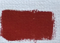 Naphthol Red by M. Graham is warmer than my Anthraquinone Red. It is similar to Cadmium Red Light, but doesn’t cost as much. It dries a little faster too, and is semi-opaque.
Turquoise
 Turquoise is a greenish blue by M. Graham. It makes great transparent blue glazes. If you mix it with Anthraquinone Red, it will make an interesting dark color. Turquoise is an interesting color I think.
Cobalt Teal
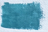 Cobalt Teal by M. Graham is the closest you can get to a cyan color. It’s a greenish, opaque blue. Also, it’s rather expensive so I would use it only when I am trying to mix with a brilliant, cyan color.
Cerulean Blue Genuine
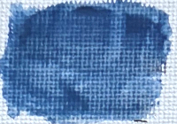 Cerulean Blue Genuine is a cool blue you might use in a sky painting. The one I have is by Grumbacher. It leans more toward green than Ultramarine Blue. It is quick drying and lightfast.
Thalo Blue
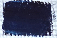 Thalo Blue by Grumbacher is a pure, clean primary blue with great covering power. Like Cerulean Blue Genuine, I would use it in skies, or where Ultramarine Blue would be too red.
Ultramarine Violet
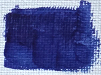 Ultramarine Violet by M. Graham is a purplish blue that works great for glazing due to its transparent quality. According to M. Graham, it makes great cool greys.
Sap Green
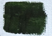 Sap Green by Grumbacher is a yellowish, transparent green. It is very convenient when green is needed, and I sometimes mix it with Ultramarine Blue to get a darker green.
Chromium Oxide Green
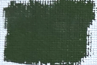 Chromium Oxide Green is a very opaque earth green by M. Graham. It is strong in mixes. Layne Johnson, someone I watch regularly on YouTube, uses Chromium Oxide Green to paint cactus and grass. M. Graham says it can be mixed with earthy reds for making soft, gentle grays.
Transparent Yellow Iron Oxide
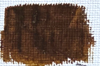 Transparent Yellow Iron Oxide by M. Graham is a transparent, golden yellow. It is very lightfast, too. I think it is better for glazing than the more opaque, Yellow Ochre or Cadmium Yellow.
Yellow Ochre
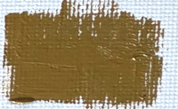 Yellow Ochre by M. Graham is a bright, earthen yellow. I like it for its warm, yellow color. I would use it earlier in my paintings than cadmiums which dry slower.
Transparent Red Iron Oxide
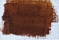 Transparent Red Iron Oxide is a red, earthy color by M. Graham. It is great for red glazes, and has a soft, creamy texture. M. Graham says it has a smooth, glass-like finish when dry.
Burnt Umber
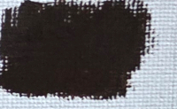 Burnt Umber by M. Graham is a warm, earth brown. It has a semi-opaque quality. I mix it with Ultramarine Blue to make a deep, dark color. A touch of it is good for desaturating a mixture of color.
Burnt Sienna
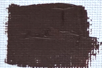 Burnt Sienna by Grumbacher is a warm, brown color. It has a semi-opaque quality. Like Burnt Umber, it can be mixed with Ultramarine Blue for a dark, black color.
Ultramarine Blue
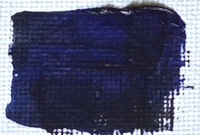 Ultramarine Blue by M. Graham is a reddish blue. It is my go to blue for most of my applications. I even bought a 150ml tube because I use it so much. Ultramarine Blue is great for making dark colors for shadows. It’s also transparent so it works great with glazing. M. Graham says it mixes well with Anthraquinone Red for mixing violets.
These are my oil paints that I use. Again, I am transitioning to the M. Graham brand, but I entertain the idea of trying out more Williamsburg and Michael Harding paints.
I don’t recommend buying all of the paints I mentioned above. Most of these are convenience colors, but I tried to describe the reason I bought them. A smaller range of colors is best when starting out. Like warm and cool versions of the primary colors.
Conclusion
I like to experiment with my colors, and I try to have a compelling reason for choosing these colors.