My Painting Process, Part One
This painting is an experiment to see what I have learned over the nine and a half years of painting lessons with Peggy Riley of Canaan, Maine. I am doing my best to do it all on my own.
Here is the image I am painting. I found the image on pexels. It’s a royalty free image.
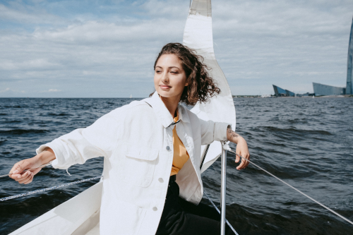
I paint in layers rather than alla prima, or “all at once”. Also, I paint front to back, and top to bottom.
I start my painting by printing out the image on paper. Then, I draw a one inch grid on my reference image.
Next, I draw a grid on my stretched cotton canvas. For this painting, my canvas is 24x36 inches. I chose this size because it is easier to do detail on a larger surface. I got my canvas from my local Walmart. I think the quality has improved over the years, and they are triple primed with acrylic gesso.
My grid on a 24x36 inch canvas is made of two and a half inch squares. This allows me to scale up the drawing. I actually calculated my squares to be three inch, but I work out from the center. I was concerned that the image would be pushed outwards on the edges, and I would lose the outside of the subject of my painting.
A correct composition makes the painting look correct. The water meets the sky above the center of the painting. Also, the horizon is parallel to the top and bottom of the painting. Otherwise, the image would look odd. I left out the buildings and the sail in the background because I want the focus to be on the woman.
I start drawing the image on my canvas. I draw the shape of my subject using the grid. I also printed part of my image at 2.5x scale. I focused on her head and hands. I lined up where her head would be, and used graphite paper to trace her head and face. I did the same with her hands, and I then you used my grid to draw her arms and legs.
I erased the grid lines when I was done. Sometimes they show through on the first layer.
Sometimes I do an imprimatura, a first layer of very thin paint with the color burnt sienna. To do so, you would mix burnt sienna with a lot of solvent. I use Gamsol. Artists make an imprimatura because they find it easier to judge colors on a non-white canvas, and you can work both dark and light. On a white canvas, you need to start from the dark values.
I was taught not to do an imprimatura. It’s just not part of Peggy’s process. I decided not to do one on this painting.
Next, I go over my pencil drawing with burnt umber. I trace it with a small, stiff brush.
It’s important to use a firm brush on the first layer. The rough canvas can wear your brushes down. I use a Princeton Catalyst flat-shaped brush.
Princeton Catalyst brushes have synthetic hairs, and they are flagged, or have split ends. The split ends carry more paint.
I learned that synthetic hairs resist solvent, are longer lasting, hold their shape, and are easier to clean.
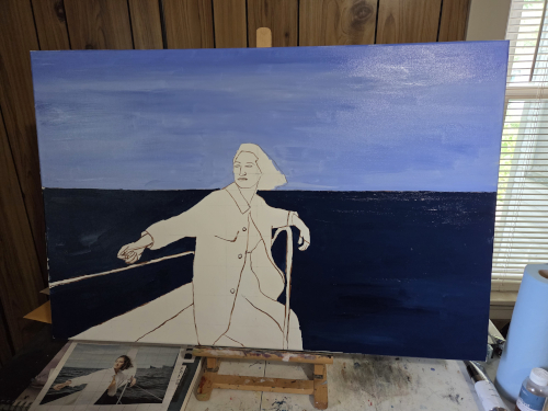
Then, it was time to put some paint on the canvas. The goal of the first layer is to just get the canvas covered. You want to make sure the canvas isn’t showing through. You can get the color mixtures close, but it isn’t the goal of this stage.
Here is my painting as it is now.
I use a combination of M. Graham, Grumbacher Pre-Tested, and Williamsburg oil paints. I am moving away from Grumbacher paints. Lately, when I squirt a bunch of Grumbacher paint onto my palette, the oil separates and leaks everywhere. M. Graham is softer than Williamsburg paints, but they are both high quality.
I started with a mixture of M.Graham Ultramarine Blue, Grumbacher Cerulean Blue Genuine, and Grumbacher Titanium White I am trying to use up. The area at the top of the painting has more ultramarine blue, and as I worked downward, I used more Cerulean Blue.
For the water, I used M.Graham Prussian Blue. I like it because it is a really dark blue. The water in my reference image is rather dark.
I had to stop here. I am examining my painting. I know that her jacket is white in my reference, but I am thinking about making it a different color. I was concerned that pure white may yellow over time.
I used ChatGPT to weigh my options. Here is the image comparing the options I am considering.
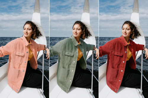
I liked the muted green the best. It keeps her head the focal point of my painting. It contrasts with the background, and complements her shirt. Here is the new image I am working from.
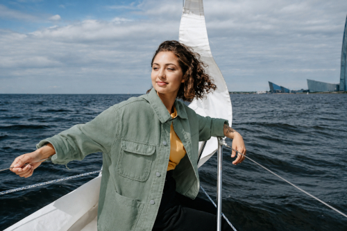
Even though I traced her head, I think it’s a bit small. So, I may enlarge it slightly. Her legs are a bit larger than her body too. My reference didn’t include the boat at the bottom. My painting does. So, I am going to fix that.
The boat itself isn’t going to be pure white either. I am going to mix some M.Graham Ultramarine Blue and Grumbacher Burnt Umber to make a black, and then mix it with a lot of Grumbacher Titanium White. The black will make it slightly grey. I mix my dark black colors by the way.
In the next part, I am going to paint the boat, her coat, head, shirt, and pants. I think I will use some canvas board to experiment with my color mixtures before I commit it to the painting.
So, keep a look out for part two of this painting process.